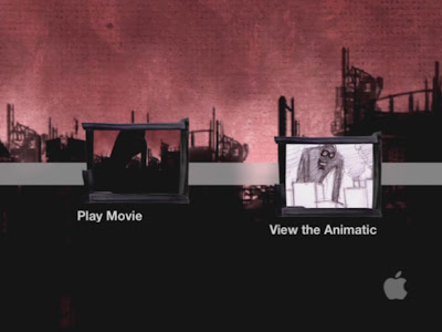
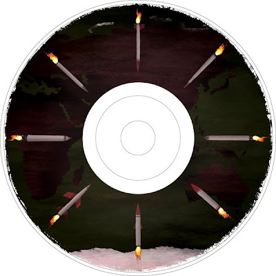
1. This was my first rough mockup design. Light scribe only burns greytones so I went on to brainstorm a few more ideas.
![](https://blogger.googleusercontent.com/img/b/R29vZ2xl/AVvXsEgeYxVDWR0JbdUFWic4tpqpCWr9hyZqt6OkpzCPvk8EWlrFvDcuVs9gX0lf0wG7IFZKq8NPOYa6pgceXspYJHJI3-qMRvdLrYgXUPradleLcASmCv11igo1CLlYXgwnWt3cREGYyRgDfRE/s400/CD_designtest1.jpg)
2. I came up with this design, but I felt it was too empty and lacking in design potential.

![](https://blogger.googleusercontent.com/img/b/R29vZ2xl/AVvXsEhDEJ8o3N3wBZowrAefT-Y4RgFcbsBbLbMHQfht1nB9lPmUU_8zmH2OjILjw8NBrsyb8qlW5o2xgNuV3hbRkmjLtWw3gmnMRhnOZu7bbb0FeppDcbKDU37NsAZ1Licez5veZah2Ox6PHWM/s400/CD_designtest2.jpg)
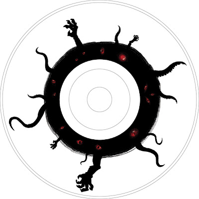
3. I then added some evil eyes into the black ring area, and placed a few more arms and tentacles everywhere.
![](https://blogger.googleusercontent.com/img/b/R29vZ2xl/AVvXsEgVsyfmMy2aTnIUfWfIpLwxspfAyC07o_sFIA-Pg4gB4oMDLLVZtyBw3CdBuijfAYKQx3OnhqRWqRfNGfM8Bnp1DRk0u4O-YMZUh0nV79Pc7Ko2hdkiUSPB_Abdg1ppoiP6-6yUOUBlkHQ/s400/CD_designtest3.jpg)
4. In my final version here below, I added some abstract lines and strokes in the back to give it depth. After taking out all the colours to make it greyscale i then added my name and other details.