Monday, October 13, 2008
50 word sypnosis for the catalogue.
Looking back on my two years at Monash it's amazing looking at how much I have grown as a designer.
Monday, September 22, 2008
Thursday, September 18, 2008
DVD Design
I decided to try a different style of designing on the CD. My friend told me about lightscribe's where the design is lasered onto the special lightscribe CD/DVD's, it sounded very interesting so I decided to give it a go.
1. This was my first rough mockup design. Light scribe only burns greytones so I went on to brainstorm a few more ideas.
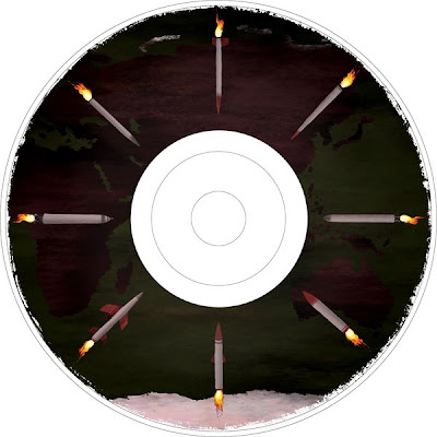
2. I came up with this design, but I felt it was too empty and lacking in design potential.

3. I then added some evil eyes into the black ring area, and placed a few more arms and tentacles everywhere.
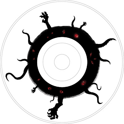
4. In my final version here below, I added some abstract lines and strokes in the back to give it depth. After taking out all the colours to make it greyscale i then added my name and other details.
1. This was my first rough mockup design. Light scribe only burns greytones so I went on to brainstorm a few more ideas.

2. I came up with this design, but I felt it was too empty and lacking in design potential.

3. I then added some evil eyes into the black ring area, and placed a few more arms and tentacles everywhere.

4. In my final version here below, I added some abstract lines and strokes in the back to give it depth. After taking out all the colours to make it greyscale i then added my name and other details.
Inside the DVD- intro and main menu
Before you go into the main menu this little video will flash up. :)
The goldfish logo was done for fun awhile ago... Why a goldfish? Well I used to go to chinese highschool back in Malaysia and one of the nicknames which I was referred to by my friends and classmates was 'goldfish'. (my name 'Kim', is pronounced as 'Jin' in Mandarin which literary translates as gold. I don't know how the fish came into the picture but yeah the fish 'yu' was added and thus goldfish 'jin yu'.)
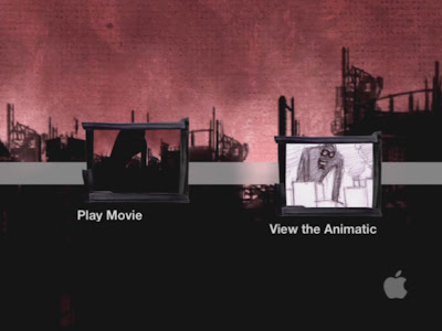
After the logo fades you are then taken to the main menu. :)
I added a little ambience sound in the BG to give it a bit more feeling of anticipation.
The goldfish logo was done for fun awhile ago... Why a goldfish? Well I used to go to chinese highschool back in Malaysia and one of the nicknames which I was referred to by my friends and classmates was 'goldfish'. (my name 'Kim', is pronounced as 'Jin' in Mandarin which literary translates as gold. I don't know how the fish came into the picture but yeah the fish 'yu' was added and thus goldfish 'jin yu'.)

After the logo fades you are then taken to the main menu. :)
I added a little ambience sound in the BG to give it a bit more feeling of anticipation.

Tuesday, September 16, 2008
Saturday, September 13, 2008
Scene one artstyle fixing
Image.1: This was one of the old versions of the first scene. I had a lot of trouble with getting this scene to blend in with the overall scenes of my artstyle.
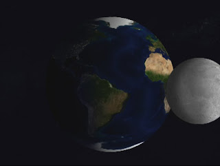
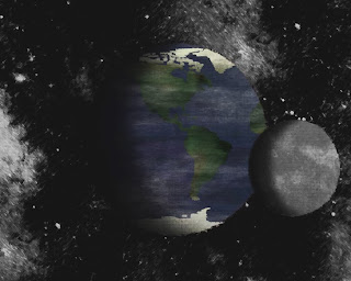
I then went back into photoshop and redid my textures using paint like brushes and texture brushes. I also painted the masks this time instead of using the eclipse tool because I was making them too round and crisp which didn't fit in at all with the overall artwork.
Image.2: Here you can see the final version of my first scene. I am really happy with the outcome and it really blends into my video stystyle so much better.
Image.2: Here you can see the final version of my first scene. I am really happy with the outcome and it really blends into my video stystyle so much better.
Subscribe to:
Comments (Atom)


